
“161 micrograms of ozone per meter cubed of air as an eight hour rolling mean”.
Sorry, how many microwhats per meter cubes of who? Yes you’re right; it needs some context, some supporting information, a bit of explanation. OK, well, what would you like to know? What is a microgram? What ozone is? What the significance of 161 is? What the European or UK law is on levels of ozone in the atmosphere or maybe you want to know what it means for you. OK well, that amount of ozone in the air is classified as ‘high’ by the UK government and if you suffer from any kind of heart or breathing condition you should not do anything strenuous and perhaps stay indoors while its high.
Data, whether it is big - like the metadata of all calls and emails passing through the US, or small like the example above - needs context, interpretation and explanation. How to present data, how to present facts and information in a meaningful way is the challenge of our time. We have become really good at producing and collecting data, we’re awash with it; we have produced 90% of all digital data in the last two years. The hard part is working out what it means and what to do with it.
Around five years ago the iPhone, combined with the App Store, became the breakthrough multi-purpose computing device of our age. A sleek slab of electronics so jam-packed with sensors and gizmos that the right software could transform it into a thousand different devices; everything from a heart rate monitor to a sonic tape measure. This technology offered us an opportunity to create an air pollution application for Londoners using the London Air Quality Network’s vast archives of data spanning back 10 years. There are almost a billion data points in the database, hundreds of monitoring stations, thousands of hourly, daily and annual statistics, a million new data points collected every week!
Oh, but the iPhone screen is actually… it’s quite small, how do we fit all of that data and information into… ah, we can’t.
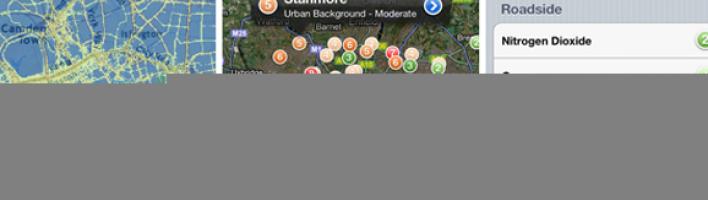
When I set out thinking about and then designing the London Air iPhone app - how to present and contextualise pollution information - the iPhone's small 320x640 pixel screen was my saving grace. Constraint was relief; the information presented on that screen has to be concise, relevant, distilled.
I scrutinised every single user interface element in the iPhone’s apps. When are list views grouped? When do blue ‘more’ arrows appear? How big are the images in the contacts app? How does supporting text appear below table cells? What is the colour and spacing of text in the email app? Gradually I began to understand the design language, of what should go where and when and importantly what should not.
I wanted the London Air app to feel immediately familiar; I wanted users to intuitively know how to navigate it, to make it feel as though it was an application that was already installed on the phone, as familiar as the music app.
We launched it, Apple featured it in the app store for a couple of weeks, tens of thousands of people downloaded it, several thousand people subscribed and are still subscribed to receive pollution notifications across the capital.
We get emails from cycle commuters who use it in the morning to decide whether to cycle or not. It is used by residents to highlight pollution hotspots in their communities. Last year a student from the Oxford Institute of the Internet used the app to conduct a survey on how temporal and spatial information about pollution affects user’s behaviour and movement through the city.
Last week I was listening to an interview with a small company in America who have produced an app that collects data on the movement of cows in large herds and feeds various metrics about the herd back to the farmer. “Is this an example of big data?” asked the interviewer. “Yes” said the developer “but its big data to ultimately make small decisions”. My hope is that the London Air app - simple as it is, condensed as it is - can help people make small but important decisions about their travel and their health in our ever expanding city.